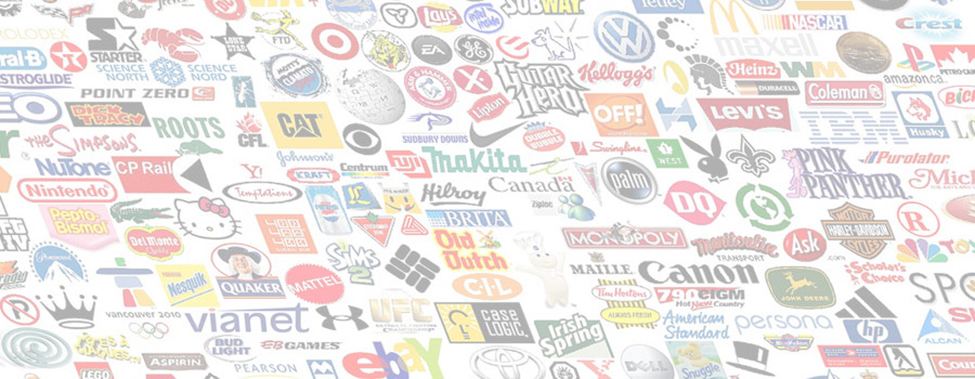
Why is the McDonald’s logo yellow and IBM’s logo blue? Is Starbucks’ famous green linked to its sustainable credentials? Why is Coca-Cola red when its product is dark black? And why did Microsoft choose to feature all four of these hues in it’s now iconic Windows logo?
Omnipresent and discreetly influential, distinct colours impact our psyche in unique ways, and marketers have long since used this phenomenon to their advantage. Far from a serendipitous choice, the decision regarding which pantone to invoke is often the result of many days, if not weeks, of deliberation.
While brands such as Coca-Cola may have made the iconic red their own (to the extent that they managed to successfully brand Santa Claus), the colours in logos are consciously chosen depending on the purpose of the logo and the kind of product being marketed. For instance, corporate logos generally have staid colours, while software companies go for youthful and trendy colours.
So, that Coca-Cola red that denotes boldness, excitement and a whole range of intense emotions, is befitting of Red Bull and Nintendo. IBM’s blue is a calming colour that we associate with authority, strength and dependability – all traits we’d like to see in a technology company. It’s of little coincidence that it features so prominently in the logos of Dell, HP, American Express, Oral B, Ford and JP Morgan.
If you are asked to think of a brand logo containing a lot of orange, then Nickelodeon probably comes to mind – a suitable choice for a colour that creates an air of playfulness and fun. On the other end of the spectrum, purple implies both royalty and mystery. It’s often found in luxury brands – or brands that wish to appear luxurious – such as Cadburys and Hallmark. Equally however, imagination is also a purple trait.
Yellow meanwhile can be quite dichotomous. Mellow tones, as seen in the McDonald’s and Nikon logos imply warmth and optimism, while that of the Yellow Pages grabs plenty of attention. Green is slightly easier to decode, but its links to peace, health and tranquility have naturally led towards sustainability connotations, with Starbucks making the decision to switch from brown to green in 1992.
Speaking of brown, did you know that UPS trucks, ever-decked out in that delightful shade of brown, date back to 1916 when the company was called Pullman Brown? Far from a nod to the company name, UPS chose brown because that happened to be the epitome of luxury at the time.
Historically, colour psychology is well recognised as a key marketing lever since hues contain rich connotations. What better outlet to channel this through than a brand’s watermark? Logos would certainly not be as effective or evocative without their consciously-chosen colours.
But when we think of colour within logos, the brands we think of come from a different era, established tens, if not hundreds, of years ago. Certain brands have been fortunate enough to be able to even trademark a colour, such is their affiliation. But the question has to be asked: In the new modern world of branding, are these iconic, colour-led logos soon to become an artifact of the past?
Secret Meanings
Did you know Nike’s logo has a hidden message? The famous ‘Swoosh’ tick actually represents one of the wings of ‘Nike’, the Greek goddess of victory. Here are some additional brand logos with hidden meanings…
Apple – There are quite a few theories regarding the symbolism of Apple’s logo. The current Apple logo is a modern and evolved version, but the very first Apple logo had the image of Sir Isaac Newton (sitting under an apple tree), while the second logo (rainbow Apple) was derived from Newton’s prism work. Some people like to believe that the logo indirectly symbolises the forbidden fruit of Adam and Eve, while a few people even believe that the bite in the logo refers to the computing term 8 bytes.
Unilever – The Unilever logo consists of 24 icons intricately woven together to form a U, replacing the old logo that had been used since 1970. Working with creative director Lee Coomber, the company used a fluid creative process whereby they thought about how and what Unilever does, whilst drawing icons and the U simultaneously.
Sony Vaio – The curvy V and A actually indicate an analog wave or signal, while the I and O represent the binary digits 1 and 0. A very unique creative, fitting of this type of company!
Amazon – Most people have used Amazon.com. and, therefore, know that the logo is self-explanatory. The text spells out the company name, but the arrow under the A and Z is quite interesting. It’s Amazon’s way of saying they carry everything from “A to Z.”
Sun Microsystems – The design is a very unique way of displaying the letters that spell out the brand’s name, S-U-N. No matter which way you look at the logo, you can read the word SUN. This stunning work was done by Vaughan Pratt.
This is the first part of a three-part series focusing on the overarching topic of brand design in terms of colour, logo and culture. Stay tuned for next week’s continuation of the discussion!