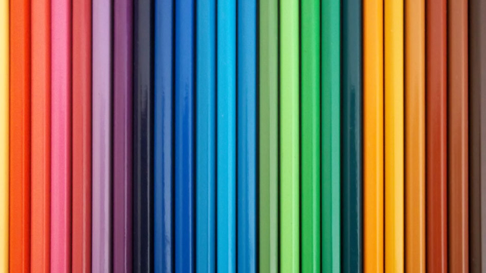
The utilization of color can be a very powerful tool in a brand’s armamentarium. That said, very few brands have effectively been able to gain a competitive advantage through the use of color. On a very basic level, color has the ability to evoke emotion. On a deeper level, color is arguably the most powerful stimulus for the brain. Coupled with personal experiences, the reaction to a particular color usually correlates to where it falls on the spectrum – warmer colors such as red and yellow – are bold, uplifting and energetic. Conversely, the cooler side of the spectrum, blue and green, exude calmness and feel more reserved. This is vitally important because emotion is one of the most powerful tools to connect with consumers.
There are three key points to remember when color is being used as a primary brand differentiator:
- It must align with your brand identity/promise
- It must set you apart as well as work within your industry
- It must be integrated seamlessly across the brand.
For a new brand, choosing a color can be a painstakingly laborious decision. This short quiz may provide some assistance with that process.
Here are a few international brands that are effectively using color as a brand differentiator and reaping the benefits:
Red: is often associated with passion and love as well as anger and danger.
![]()
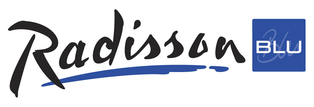
Blue: evokes feelings of calmness and spirituality as well as security and trust.
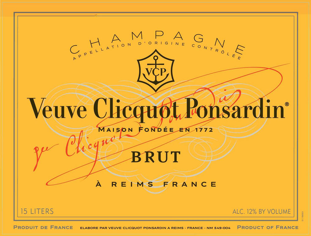
Yellow: is associated with laughter, hope, and sunshine.
Green: symbolizes health, new beginnings, and wealth.
Color Emotion Guide
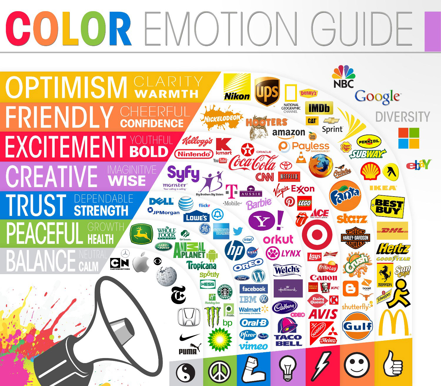
Photo: Philip Taylor / Flickr
Infographic: The Logo Company