
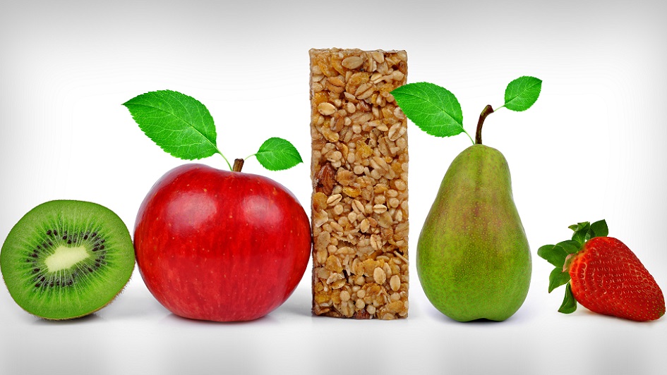
When we stumbled upon the energy bar aisle, we couldn’t help but stare. The category is huge and with this sizable amount of high-protein, low fat and gluten-free options comes a lot of competition for the shopper’s attention.
How do these brands meet their consumers’ long lists of needs? And how does the functionality of the packaging help consumers achieve their goals? Be it dietary concerns, losing weight or searching for a jolt of energy on the move, brands are striving for the best solution to fit their customers’ needs in a highly competitive category.
First impressions in the aisle: What were the eye-catching moments?
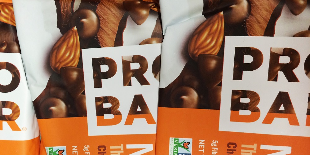
When our researchers took to the aisle, the range of colors and designs surprised them. When specifically looking at product packaging, many that caught their attention were those with a matte finish, frosted windows or interesting colors and graphics. The vibrant, bright orange color of Probar’s package is hard to miss and stood out among many other bars that use earthy colors.
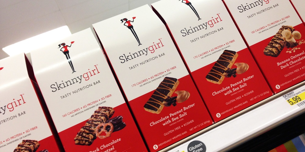
The Skinny Girl brand also piqued an interest for our team. As an existing brand transitioning from the liquor store to the energy bar aisle, their unique box design and its shape help them find essential product exposure. Even better? Upon taking a closer look at the packaging, our researchers noticed an intriguing detail: Their flirty, Skinny Girl logo woman takes on a new “active” look. Clothed in workout clothes instead of her martini-glass getup, her new look captures the essence of the product: A trendy option for active women on the go.
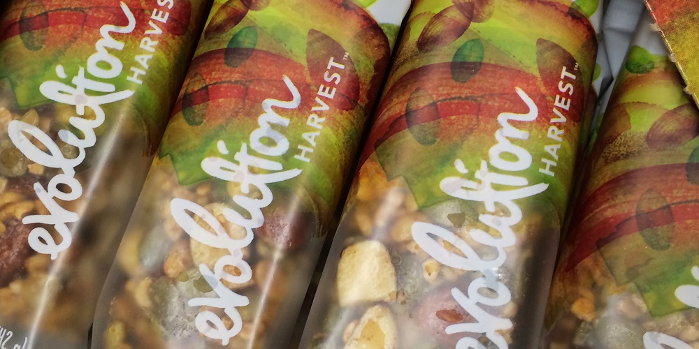
Honorable mentions for other brands that stood out in the aisle for their visual language and overall design go to GoMacro, Lara Bars and the Evolution brand packaging. Their colorful and smart approach to visually explaining their product and brand captured our attention and intrigued a close-up examination of the product and its benefits. Engaging customers with a brand in the aisle using unique, visual language and design gets the product one step closer to the check out lane.
Bringing something new to the table.
Epic bars were one of the most intriguing brands on the shelf because of their introduction of meat into the category. Yes, actual meat. For some, this seemed like a unique way to get a surge of protein into the body – and in such a way that seemed more natural than chemicals or tastier than peanut butter or nuts. A few from our office were still not convinced, but to each his own. However, the elegance of the package design had us picking it up and bringing it to the register before we realized what was nicely wrapped inside. This just goes to show how significant of a role a product’s packaging design can have on the actual point of sale.
Looking to the future. What would make this category’s packaging better?
Our very active office suggested that easier to tear packaging would benefit some of these brands. If the package is easier to use, and if it gets the intake of calories and protein needed at the peak of a race, then it’s surely going to be chosen among the array of products.
At what point on a cross-country run should a Powerbar be consumed? Or, for the modern day soccer mom, it would be more convenient for her to grab a few bars to throw in her cart with confidence that her energy bar of choice will curb her hunger between soccer games, without spiking her blood sugar levels. Like selecting face lotion for sensitive skin, if brands specifically identify how the bar assists with certain activities or lifestyles, it will be easier for consumers to understand how it will benefit them.
We’ve studied this aisle up and down, forward and backward. Even with the array of flavors, package types and appetites served within this category, what will the next innovation in this rapidly-growing category be? We’ve got some ideas and invite you to engage with us in the conversation.