After a long dry spell amid the DTC landscape, now’s the time for logo design to be revived for new frontiers.
As graphic designers, we’re willing to admit it: Brand impact today is rarely down to iconic logo design alone. In a world where marketing budgets are being diverted to TikTok, and YouTube videos can effortlessly communicate brand story and personality, logo design has, in many cases, taken a back seat.
The age of the wordmark
Over the past few years, what we’ve witnessed more and more is the so-called “blanding” – pared-back design created for digital. The DTC boom delivered a visual landscape of straightforward wordmarks in trend-led fonts that echoed the effortless simplicity of that business model and added a pinch of in-the-know style. This kind of aesthetic enables a product-is-king approach, where challenging complexity and cutting out the middleman is positioned as a consumer win. These brands have shown that, when packaging doesn’t need to compete on the shelf, and the digital landscape allows for omnichannel marketing, a quick and dirty approach to graphic design can be enough in the short term. But what of brand longevity?
Tap the app
For brands who rely on digital interaction via an app, the logo is proving its worth. Recognizable doofers from Tinder to AirBnB make usage feel intuitive, short-handing the brand in a symbolic way that works far harder than simply reducing a wordmark to a monogram. And, as we move into a more dimensional digital world, such symbols will be better placed to make the leap from 2D to 3D.
Behold the Metaverse
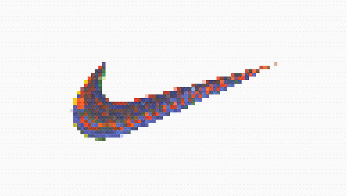
The Metaverse looks set to return us to a more physical space – albeit a virtual one. And in these new multi-dimensional virtual worlds, a flat-color wordmark just isn’t going to cut it. Symbols will be key in showcasing brands in these spaces – from the swoosh to the golden arches, logos that are instantly communicative and recognizable will have the edge in virtual reality.
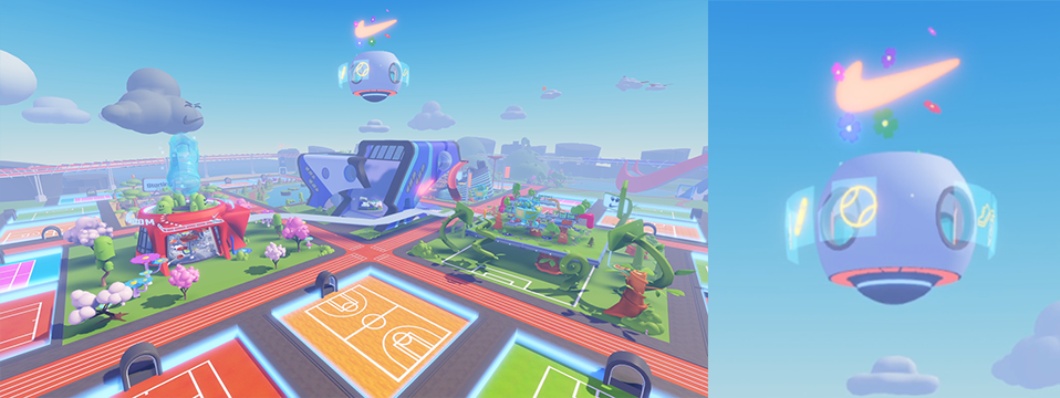
Consider the Nikeland Roblox experience or Roblox Vans World. The Nike swoosh might only be a subtle part of the complete experience, but it’s an essential one. As is the Vans logo and checkerboard. Just as marketing landscapes and content become more and more sophisticated, ownable and symbolic equities will come into their own, retrieving their rightful position in the marketing mix.

Unlike the arches, the swoosh wasn’t originally designed to be 3D, but its simplicity lends itself to motion. We now have the opportunity as designers to think differently from the get-go – creating symbols that are crafted to be seen from all angles and made to move. Until very recently, this was the preserve of TV idents – specifically the ground-breaking work of Martin Lambie-Nairn for Channel 4 and the BBC in the 80s and 90s – which still inspires us today. More recently, brands such as eSports platform Andbox, designed by Mother Design, show how identities come into their own when they are designed for video, virtual, and print from the onset.
Symbol status
In tomorrow’s world, ensuring that your brand can live simultaneously in the physical and digital world will mean a lot more than whether you can use it on a website and print it on a box. Can you recognize it on a storefront in a new gaming universe? Can you animate it, pulse it, and spin it, and still know exactly what it is?
Now is the time for logo brands to come into their own. Identities will need to become braver, bolder, and more symbolic as brands understand that they have just moments to create recognition, emotion, and meaning across changing worlds and touchpoints. And, of course, it’s not just about the logo – unique and bold colors, unusual typefaces, complex layering and textures are all being embraced as brands aim to strengthen their IP and ownability.
For brands that truly want to stand the test of time, the importance of strategic, ownable, and symbolic visual identity has never been greater. Creating something that is engaging and recognizable when static but can also be elevated and flexed in an ever-changing online world is now the new benchmark for brand design.
Cover image source: Kunal Patil