
The apple with a bite, the golden arches and one and half glasses of milk are all brand signifiers that we can immediately identify without having to utter the name of the company they belong to. A brand’s visual identity (VI) is just the tip of the iceberg, but an important point of recognition for consumers in contact with the brand. Whether a sign off at the end of a tailored experience, or introduction before a conversation has begun, a visual identity is key to brands when developing a relationship with their consumers. Something to nurture and embed within all communications.
Of course, developing an iconic visual identity takes years of work, yet one only has to look at brands like Apple, McDonald’s or Cadbury to see how crucial investment is. But what happens when a brand dares to alter its visual identity? And more importantly when is it, if ever, a good time to make a change?
In order to answer these questions, one needs to begin by asking ‘what makes an iconic brand?’ The answer is simple. An iconic brand is one that defines or even owns its category; it’s the first brand that comes to mind when you think of the sector it belongs to. For example, if anyone asks you to think of soft drinks, there is a considerable chance that a red bottle labeled Coca-Cola immediately springs to mind.
When considering what makes for an ‘iconic’ visual identity, we see that true success lies with those brands that are still easily recognisable when you abolish key elements. Those brands for which the company name is arguably less important than the toolkit used to bring them to life. Icons are built over time and consistent brand experiences, and it is only once this status is reached that a company may look to minimalise a mark or identity system – safe in the knowledge that they have built enough equity and developed strong relationships with loyal consumers. A number of brands have taken this approach and succeeded. The two most obvious examples from recent times are Starbucks and Absolut.
SEE ALSO: Brand Design: A Colour Commentary
Both are leaders in their respective sectors and both have developed strong signifiers that consumers can instantly identify with, like Starbucks’ white and green siren or Absolut’s iconic bottle shape. Both can easily be recognised even when you remove key elements such as the name of the company or description of the product, and, rather interestingly, both brands removed exactly that when simplifying their VI.
Starbucks dropped their brand name and the word ‘coffee’ from its logo, and Absolut removed the words ‘Country of Sweden’ and ‘Vodka’ from its bottle. Removing a word mark to leave only the logo requires broad brand awareness if you’re to ensure that you don’t confuse or lose customers. When we look at Starbucks and Absolut, both were clever in keeping many of their iconic signifiers, and the result was a solid, refreshed VI, which did not infringe upon the customer’s experience of the brand.
This brings us squarely onto the risks when altering your VI – the biggest and most obvious being the loss of customer loyalty. This is the key reason many brands fear making the change or don’t quite understand when to make it. It’s important to remember that when people become brand loyal, they are not only loyal to the product but also its aesthetics. The danger of rebranding is that customers can be too attached to the old concept to accept the changes.
In 2009, Tropicana (owned by PepsiCo) learned a rather harsh lesson about consumers’ connections with their packaging. Earlier that year, the company made some drastic changes to the visual identity of their flagship product by replacing the image of an orange pierced with a straw to a picture of a glass of orange juice. They also implemented a vertical logo with a new typeface. The result was hundreds of customer emails, letters and telephone calls all complaining about the changes. Essentially, consumers found the product difficult to distinguish among the varieties of Tropicana, as well as differentiating it from other juice brands. It was reported that sales of the Pure Premium line dropped by a massive 20 per cent between January 1st and February 22nd. Certainly not the result PepsiCo was aiming for.
SEE ALSO: The Role of the Logo in the Third Age of Branding
What PepsiCo hadn’t acknowledged is that customers appreciated the classic pre -2009 design. Familiarity breeds trust in a product, and reliability is of particular value during a time of constant change and development. Tropicana didn’t take this into account at first, but their reaction to customer out-cry saw the brand revert back to the old packaging by the end of 2009, proving that they were listening. This is a good example of an iconic brand misjudging when a VI might be altered and, more importantly, to what extent. A VI overhaul has the power to be disruptive, and not necessarily in a good way; in these instances, the old adage ‘if it ain’t broke don’t fix it,’ rings true.
That’s not to say iconic brands cannot alter their VI. Shell, itv, Channel 5, HSBC and, of course, Absolut and Starbucks are all perfect examples of brands refreshing their visual identities to successfully contemporise their communications. The reason for their success comes down to keeping the customer front-of-mind. These companies acknowledge that a brand’s identity goes way beyond a logo – it’s about the experiences they offer. These experiences and brand signifiers weren’t altered to the point of being unidentifiable, thus making the transition for customers more seamless.
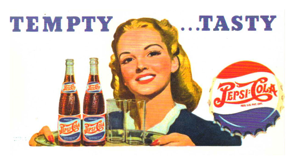
Image: Vintage Pepsi ad