A number of years back, the word ‘disruption’ was handed a new lease of life. Delivering a new raison d’etre and identity to countless entrepreneurs, disruption is now an innovation phenomenon with a David-and-Goliath storyline: The small company with limited resources targets an overlooked segment of the market and uses technology to challenge the large, established businesses.
In best-case scenarios, this leads to gaining a foothold in the market and ultimately leaving the incumbent giant staggering.
I believe that dissonance is emerging as the packaging design’s latest disruptive tool. Dissonance is more likely to be picked up by small brands, since large, long-established brands usually build their messaging around broad appeal and as such are less willing to take risks. It’s the smaller brands, the newcomers and the niche, who are likely to leverage a little-loved design trend to gain standout. There’s a lot to be learned from dissonance, from its fine art origins to the way designers access it, to when a great idea can go terribly wrong.
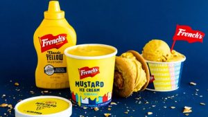
Image source: The Dieline
A Storm in a Teacup?
Painters and sculptors have long used visual dissonance — perhaps most notably in the genre of Surrealism — to activate a state of psychological tension and to confront onlookers with their own unfulfilled expectations, forcing them to register a disparity between what they expect to see and what they actually see.
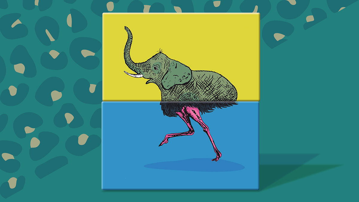
Surrealist René Magritte famously manipulated dissonance in a series of groundbreaking works that subverted the status quo through the misnaming of objects, doubling, repetition, mirroring, concealment, and depictions of visions seen in half-waking states. However, Surrealism’s most notorious example of visual dissonance is Mere Oppenheim’s fur-lined teacup — a piece that has been triggering lust, laughter, disgust or delight for nearly a century now.
These works demand attention and catapult our intellectual effort far beyond the casual glance. Onlookers must resolve the tension, or simply abandon the piece altogether. While some resolve the conflict by simply turning away, denying the sensory impressions, many onlookers will try to overcome the dissonance through cognitive means, i.e. taking a closer look.
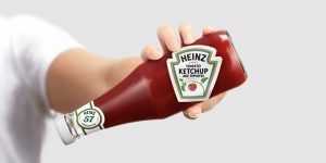
Image source: The Dieline
Harnessing Visual Dissonance
The evolution of ultra-precise production technology has provided packaging “artists” with nearly limitless capabilities, and in effect this has been the chief enabler of purposeful dissonance.
Flawless printing has allowed textural design techniques, as the pack face approximates a non-traditional material so authentically that the consumer is momentarily thrown. Beauty brand Clé de Peau’s luxury-fabric box front was created by premier Japanese kimono-fabric designers for an utterly unique, realistic appearance. Another excellent example is Kasper Ledet’s experimentation with texture and obscurity for Danish craft brewer To Øl. Quality printing permits dissonance, such as on a spirits container which claims, ‘This is not a luxury whiskey,’ a Magritte-esque statement which would be believable if not for a faultless, high spec finish.
The importance of precision and balance can be verified by the way musicians employ dissonance to provoke attention and manipulate mood. An expertly performed chord of irregular, clashing orchestral music leads to a sense of satisfaction in the listener once the harmonic notes follow, however permanently dissonant music is usually too difficult for the listener to bear. Without balance, the dissonance overwhelms, and the power in the contrasting consonance is lost.
Likewise, if we take the use of blur as an example of dissonance in packaging design and examine what makes a label, which appears to be an obscuration of a figure behind it, actually work, we may point to the perfect balance of colour and white space, the crisp logo and font serving as the anchor, permitting the dissonance. If you fall foul of flawed elements, don’t be surprised when your customer leaves the bottle on the shelf.
Image source: The Dieline
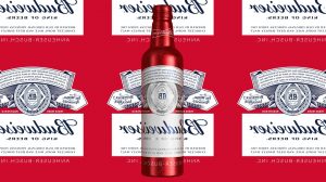
Image source: The Dieline
When Dissonance Goes Wrong
We have to be stringent as to what constitutes ‘dissonance,’ and prevent ourselves from describing every creative new design as dissonant, just as we can’t call every innovation ‘disruption.’ To truly use dissonance, there has to be that tension, those flashes of hesitation, cognition, resolve. It’s worth remembering too that we live in a world where emotions are cultivated for profit, and the use of aesthetics to activate micro-stressors hedges towards the unethical. Triggering a jarring feeling or confusion within the consumer calls for responsible handling — the aim isn’t to distress, it is to tell a story.
This year, in particular, we should give credit to those who break the mould. Pantone has presented us with possibly the safest color choice in a decade — and in this era, brands are likely to embrace wide appeal and opt to reassure rather than challenge. In picking up the dissonance trend, there’s more than one tightrope brands and designers will walk.
But then again, being the disruptor was never going to be easy.
Cover image custom tailored by Equator Design for this exclusive article.