It’s easy for a brand to look good these days. Pick a trend, brief a reasonably capable designer, and hey, you can stand up on a shelf or on-screen alongside global brands. But quickly you’ll realize there’s more to it than pared-back logos, sans serif fonts, and bold colors. Or whatever trend you’ve chosen to follow.
To stand out and succeed, a brand needs to be about more than aesthetics. It’s this insight that’s driven so many to look to brand purpose. And while purpose certainly matters, it’s nothing without a powerful personality, character, and point of view. This is your attitude. It’s how you express and live your purpose. And I believe it’s what’s most effective in engaging your audience.
Attitude is often conflated with aggression; so, to be clear, that’s not what I mean here. I mean the combination of your brand’s story and its style. The verbal and the visual, coming together to capture the spirit of the brand. And frankly, it’s a belief that, when it comes to branding, words can have more weight than pictures.
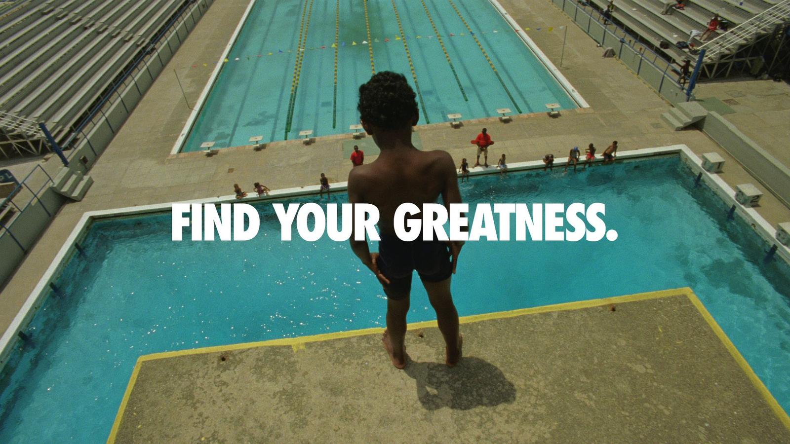
The obvious example is Nike. Sure, the swoosh is iconic and it captures the unrestrained joy of sport, but for me, the real power of the Nike brand comes from what it says, not how it looks. It’s the words – and attitude – that conveys its purpose. Nike has a mindset and a standpoint. They believe in individual strength and persistence over perfection – and they articulate it with authenticity and emotion, time after time. Nike sells attitude, not apparel, and it doesn’t need the swoosh to do it.
Take a stand. Challenge orthodoxy. Be more human.
Nike’s the obvious example – and sure it’s easy with a billion-dollar budget – but it’s far from alone. Typically, we find there are three approaches to attitude.
Take a stand
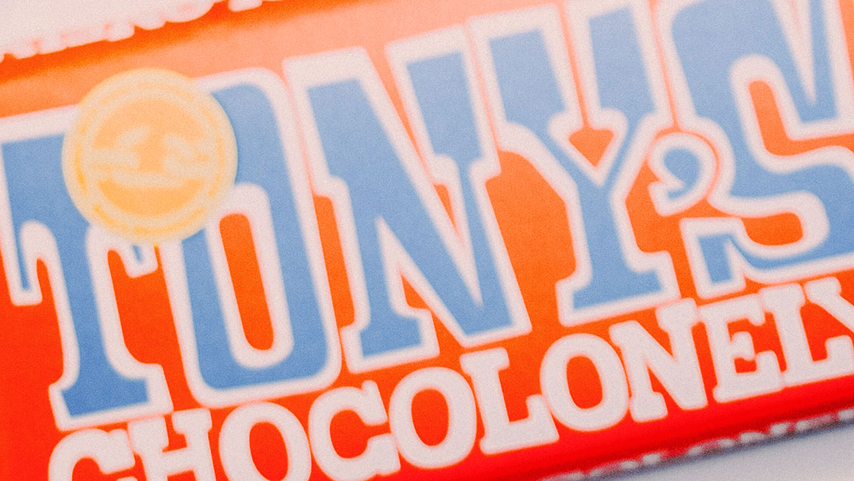
Since its launch in 2005, Tony’s Chocolonely has been taking a stand. Campaigning for slave-free chocolate, it’s a brand with a mission to rewire the cocoa industry, making sure people know it’s “crazy about chocolate, serious about people”. Tony Chocoloney’s unapologetic messaging alongside their bold use of color and jarring typography delivers a standout that feels uncomfortable. But that’s the idea. Thecla Schaeffer, the company’s CMO, explained that they wanted to use their signature color “as a symbol for the alarming situation in the cocoa industry”. Meanwhile, bars broken into unequal pieces and advent calendars with missing chocolate creatively convey the seriousness of the subject. Verbally, headlines like ‘The Sweet Solution to the Bitter Truth’ and ‘Raise the Bar’ use personality to drive purpose.

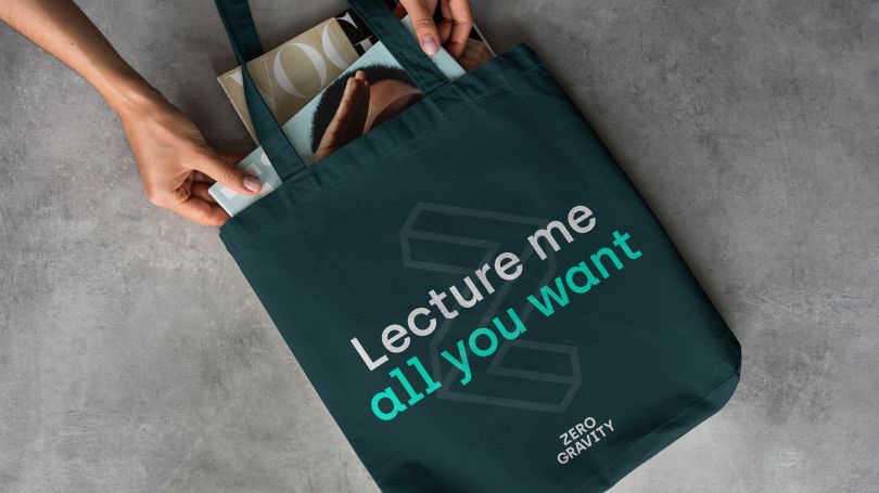
Zero Gravity is also taking a stand, wanting to make elite universities accessible to ambitious students from unrecognized backgrounds. It launched as an ed-tech startup in 2020 and by next year it expects to have helped 10,000 young people into the UK’s top universities. As a free online platform that connects state-school students with university mentors, the brand needed a strong attitude that would leave a lasting impression. The tone of voice challenges society’s misconceptions about low-income students. Using phrases like ‘Defined by potential, not postcode’ and ‘Lecture me all you want’, is a clear challenge to help young people to realize their potential. Their attitude is a breath of fresh air – an authority in the sector with a clear purpose and point of view.
Challenge orthodoxy
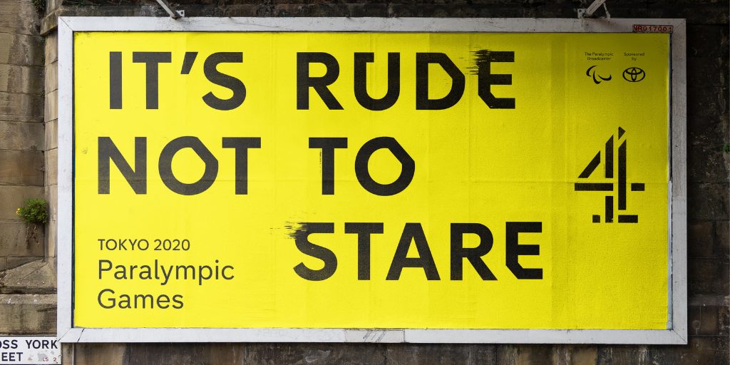
Its future might be under threat, but for now, Channel 4 is a brand with a lasting attitude. It’s not family-friendly ITV or corporate BBC. It’s not afraid to challenge convention. From its successful ‘Complaints Welcome’ campaign to the 2020 Paralympics, they’re not afraid to flip social etiquette on its head. Phrases like ‘To be a Paralympian, there’s got to be something wrong with you’ and ‘It’s rude not to stare’ powerfully open conversations about disability and the determination of Paralympic athletes with real and unparalleled pride. Their consistent use of jarring typography and color palette also conveys this attitude – it is distinctive, fresh, unusual, and complements their desire to shift perceptions and challenge the status quo.
Be more human
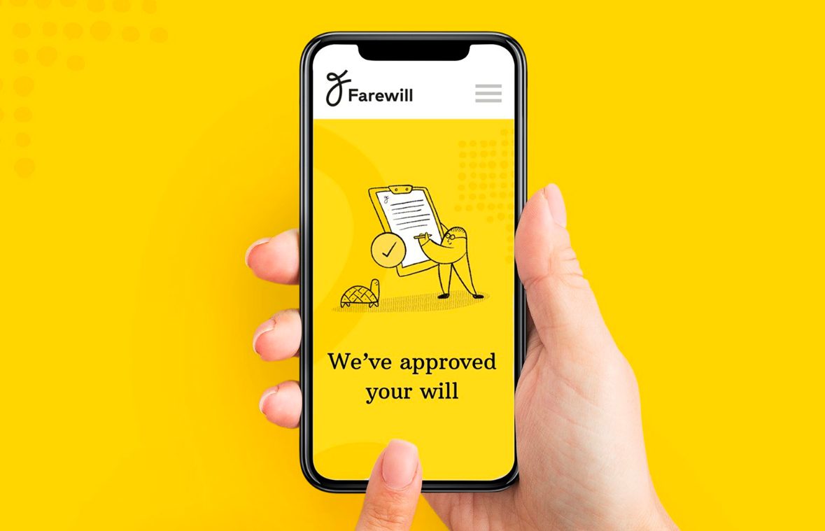
Lastly, there are the tech brands that use attitude to be more human. Whether it’s humor, wit, intelligence, or empathy, they move beyond technical features and express a way to make people’s lives better. A great example of this is Farewill. The brand is all about using technology and design to modernize the way people write their wills but, challengingly, find a way to create a positive user experience when confronting death. As Farewill’s Sarah Creuer puts it, “losing a loved one is one of the toughest things any of us will ever have to go through. And the big, scary industry behind it doesn’t do much to help. Tombstones, mountains of paperwork, and rainy funeral processions – these are the images that spring to mind when we think about death. So is it any wonder we all find it so hard to deal with?”.
The brand has harnessed technology and tonality to create an attitude that shifts people’s experiences from detached formalities around experiences of death. Using a tone of voice that is more personal and friendly, the attitude reflects the audience’s need to be heard and supported at such times. Visually, a flowing ‘F’ symbol, unapologetically optimistic yellow color palette, and warm illustration style developed by Anna Charity (the visual mastermind behind the revolutionary mindfulness app, Headspace) breathe life into the subject of death.
Finding attitude
Attitude cannot be conveyed by visuals alone. It needs words. Visuals get attention, but words explain why it’s relevant. And this is why so few brands have attitude. When it comes to brand, we look to the more tangible visuals. The branding industry has for a long time been synonymous with the commercial aesthetics industry.
But it’s changing. I was inspired to set up my company by what I’d describe as attitude-led agencies from Down Under – the likes of For The People, Re:Sydney, and Interbrand Sydney. They took a bold approach to the importance of language and messaging in brand standout. I’m seeing this approach more and more here in the UK, and I think its popularity will continue to grow.
Ultimately, we live in an ever more vocal world, and what you say and stand for is the new currency. The most successful brands are those that put as much emphasis on what they say as on how they look, and who spend time crafting their point of view. It’s hard work. If looking good is easy, then defining and expressing an attitude takes time and effort, but as the likes of Nike show, it’s time well spent.
Cover image source: Hello I’m Nik