“In an age in which every brand touch-point is under the microscope to find opportunities for optimization, it’s only natural to start with typeface. As the voice of the brand, typeface can bring brand strategy to life through every written message.” At the recent Transform Conference in New York City, I attended a session entitled “Bringing Brand Strategy to Life with Typography” and presented by Fabio Haag, creative director of the type foundry Dalton Maag. Throughout the presentation, Fabio illustrated “how brands can benefit from careful typeface consideration and gave an insider’s look at how design forms translate into brand attributes, help to cross the bridge between strategy and typeface design.”
Here, we present an abridged version of Fabio’s talk – an edited compilation of valuable insights, all from the man himself.
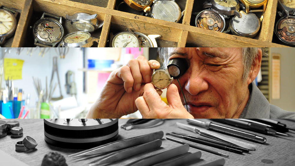
 “At 15, in school in Brazil I took a vocational test and the result was that I should become a watchmaker. I was so disappointed – a watchmaker? That’s so boring! It was only a couple of years ago that I realized the test was very precise and correct in a sense of my skillsets.
When I look at the watchmaker (photo), what they do is precisely what designers did in the days of hot metal type with drawers for upper case letters – in the upper case – and lower case letters – below in the lower case. When you look at the watchmaker who pays so much attention to detail, I can easily relate to what I do as a designer of fonts and letterforms.
RELATED: Why We All Should Be Investing in Design
There is even more to that because, it’s not only about how letters should look like on their own, it’s how one letter interacts with others. There is a harmony, an arrangement, just like being a cook. And, more important, there is the reader’s perspective – watches tell time. People need to read, people don’t want to see fonts.
But there is also an emotional attention because there are watches of many different sizes, features, and dials that represent different personalities, just like fonts.”
Fonts Have a Silent Power
“You many not realize it but we’re surrounded by fonts everywhere. Do people really care about fonts? Well, yes. Society depends on them. Fonts are absolutely everywhere but we often don’t notice them. Our firm has 50 people who design fonts. When you think about it fonts have a silent power.
SEE ALSO: The Responsibility of an Iconic Brand in a Changing World
Sarah Hyndman gave a TED talk “Wake Up and Smell the Fonts,” where she discussed an experiment in which she gave two groups of people the same candy but in different packaging. One package had rounded curvy shaped type, the other hard sharp, angular letters. People perceived the candy in the rounded type package as much sweeter, even though they were both the same! We are now slowing moving to prove scientifically, what we typographers have known intuitively – fonts can actually change perceptions.
The key question is, how can we make use of this information? If we know fonts can change perceptions, if we know they are everywhere – look at the brand touch-points- fonts appear in almost all of them. If you think of assets to build brands, the font is as important as the logotype, as color. It is an essential design element. With one designed font you can achieve a multitude of different touch-points with a single element. That’s powerful.
Earlier I said that people don’t notice fonts and that’s actually an advantage because people don’t want to see more publicity, more brands everywhere. Yet people need to breath. It’s a great channel to carry the message of the brand through the typeface and deliver its message without being intrusive.

As a type designer we have to show old stuff – the Roman SPQR, which actually was the first case of typographic identity. We still use this 2,000 year-old Roman upper case today and it’s still a powerful brand element. If you think about it, the Roman Empire stretched across Europe, into North Africa and Asia. It was massive and one of the ways to maintain organization and cohesion was to raise the SPQR monument whenever they conquered territory. And they used exactly the same letter fonts, which we use today. Even if the local people couldn’t read, the shapes were known; the typographic identity was understood. There is this epic feature that is carried to us even today. If we look at movie posters, the font that we see in Roman letters is almost everywhere.”
SEE ALSO: Why Every Brand Could Use a Chief Narrative Officer
Updating Knight Frank
“To apply this to a real world example- we designed a new font (shows Ks slide) for Knight Frank, a 100-year-old European real-estate firm that even sells castles, but was losing its appeal to a younger market. Are the three Ks the same or slightly different? One thing they have in common is the contrast, the difference between thick and thin strokes that we took from the Romans. That adds seriousness, tradition.
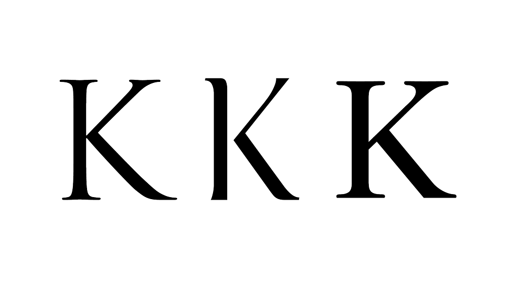
Thick and thin is what you find in Times Roman, for example. They all have serifs but they are different. If you notice, the new Knight Frank ‘K’ has semi-serifs, which is a contemporary example. It’s not a classic principle. So different type features tell different stories. We have the seriousness of the contrast, from the Romans, and we have something contemporary, the semi-serif, all in the same letter. The result is something classic that doesn’t feel old anymore. You know it is going to be expensive to work with them. They have a century of existence.
It’s important to mention that for centuries the contrast between thick and thin lines remained the same but because of advances in technology the lines have become thinner and thinner. Today’s papers are of better quality, the inks won’t stretch. So we arrived at typefaces like Bodoni and other type styles that can only be printed on very high quality material. These latest styles are associated with luxury; we still see them in high fashion magazines and in luxury brands, which naturally make use of this high contrast letterform style- very thin hairlines, very thick stems. We mentally accept this; it’s been around forever. It has become part of our visual DNA.
RELATED: How Big Brands Foster Global – Yet Regional – Loyalty and Awareness
We may not realize it but we are very lucky today to experience a massive change in media. We are reading on-screen more than ever. Since Gutenberg, for five centuries, we read on paper. In our generation it is changing to the screen, which poses many challenges and at the same time opportunities. How we use fonts to communicate in the digital environment, on the web, is changing dramatically. We have a revolution and we need to make sure that we consider fonts.
In my opinion, we are living in a new Golden Age of Typography. Technology has advanced to the point that we can create complex fonts more easily than ever before. It’s become so much easier to commission a new font. They say 50 fonts are introduced each day. Your brand now is able to carry the same message in all different script systems, which means you are speaking in the native language of your customer wherever he or she is. This is really powerful.”
Images: Fabio Haag’s presentation at the 2015 Transform Awards in NYC