One of the greatest feats of simplicity in the business world is the way in which Google has maintained the purity of its home page. Seventeen years is a long time to say no to countless requests to “add just one more very important thing.” Distinctive in its sparseness, with just a sprinkling of key items, it never succumbed to the corporate land grab for home page real estate. This laser-like focus is more than a design aesthetic, and is of particular note given the vastness of Google’s mission: “To organize the world’s information and make it universally accessible and useful.” If they can fit the world’s population through one unadorned doorway, they clearly understand simplicity.
One of Google’s floodgates has been its ability to say “no” through a process rather than a battle of wills. By making potential “complicators” audition new features on the advanced search page to show the value of their proposed addition and then putting finalists through a scoring system, they take the sting out of rejection.
This mechanistic method avoids hurt feelings but could easily have led to a pristine home page devoid of humanity. Google avoided the pitfall of sterility with ever-changing dressing of the Google logo, the now-famous “Doodles.” The holiday versions of the logo started out as “out of office” messages when the company was so small it had only a handful of employees, but what Google stumbled upon was the dash of “emotional design” needed to bond customers to its brand.
A brand built solely on logic and function, without emotional appeal, doesn’t engage all parts of the human brain. Logic merely reassures us that the emotional choice we want to make is also a smart, rational one. The home page phrase, “I’m feeling lucky,” has an element of mystery, a dose of whimsy, and a dash of hope. It breaks the pattern of Spartan design and sterile logic by intriguing us. Most people don’t intuitively know where “Lucky” leads and even when they are shown, won’t think it describes its function very well. But Google uses it because it makes them “likable” and customers tell them to keep it for that very reason even though it isn’t functionally descriptive. Making sure people know that Google is made up of people with a sense of humor is as critical as function.
Google also knows when to stop listening to customers and rely on its employees’ expertise. They realize that customers can’t be expected to understand the consequences of their wishes—customers always say that they want more results per page, but catering to that request would slow response speed. Google anticipated, years ahead of others, the phenomenon of “micro-moments”— shopping by mobile device in a few moments between productive tasks. Describing the desirability of “interactions that are small and fast,” Diane Currie Sam pointed out in a recent Inc. magazine article that no matter what consumers say, the reality is that they buy more from less cluttered, simpler web pages.
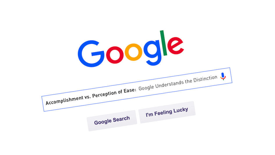
Google considers customer experience from the standpoint of accomplishment versus perception, a valuable distinction that is overlooked by many companies. Accomplishment is tied to usability. Basically, can the user complete a task successfully? Companies’ usability labs often focus on this measure to the exclusion of other key components of the overall experience. I might put the toy together after three hours of hard labor, but was it a pleasurable experience? Perception of clarity is the measure of how the user feels about the experience—obtaining the answer to a question on the first try with a resulting feeling of confidence. Simplicity is a design aesthetic. A website, for example, may be useful and clear, yet not particularly simple. The look and feel of Google’s logo and home page conveys an attitude of simplicity. The balance of logic and emotion is maintained by keeping an eye on both accomplishment and perception.
Google recognizes that successful customer experience must encompass all three takeaways:
Usability = accomplishing a task
Clarity = feeling good about the process
Simplicity = achieving a design that hides complexity
Google ensures simplicity through its “points-driven” audition process, measures usability through task-based testing and achieves clarity by changing the perception of the user. Google makes achieving something really complicated seem really simple.