
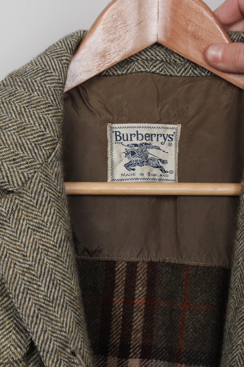
Burberry, recently derided for burning approximately 30 million dollars worth of unsold luxury clothes to allegedly protect against counterfeit products, took a match to 160 years of heritage with the announcement of a new brand identity.
Last week, the company revealed a new logo and monogram created by graphic designer, Peter Saville. While it serves as a dramatic change for the heritage label, the new identity lacks all distinctiveness. Gone is the proud knight on horseback. Gone are the tailored serifs.
![]()
Brands must evolve and titans, such as Burberry, bear no immunity. The former identity had its own flaws including typography appearing digitally stretched and stenciled shapes within the horse and rider, which felt unloved. Nonetheless, to throw away such recognisable assets in order to refresh the brand identity seems reckless. Thoughtful crafting and editing of these details could have led to a reinvention of their desirability, evolving the core equities to retain its recognisable pageantry while aspiring forward to achieve a contemporary edge.
The new logo has the look of a brand born today rather than an icon that is more distinguished. A more appropriate approach would aim to bring depth to the former logo. Instead of abandoning the knight on horseback standing proudly above the brand name, one might re-illustrate a contemporary version addressing the complicated strokes and shapes. By re-illustrating the silhouette and shading details, an extractable design asset could be achieved and the heritage and romance of the original crest (first introduced in 1901) retained. Notably, we’d suggest keeping the serifs. The serif type, if refined from its awkward proportions, provides a certain tailored quality that can retain legacy cues for the Burberry brand be it digitally displayed or embroidered.
Considering the full visual identity system, it’s important to acknowledge that there are instances where retaining the full logo lockup would not work. Part of the process should be establishing standards for the logo variations with both modern touchpoints and manufacturing considered. Such a holistic approach is modelled by brands like Chanel, which implements the full logo in digital branding but provides variations of their mirrored c’s that appear on products like sunglasses, earrings, etc. without losing their recognisability. Whereas Burberry’s new identity seems primarily befitting of a corporate identity, a full exploration of an iconic logo should consider the product as well as the brand history.
Burberry has long been recognised for patterns. The company’s tartan plaid has inspired many imitators from well-known retailers such as Target and JCPenney. Even the newly released monogram, also designed by Peter Saville, seems like a replacement of a core component of the brand. The result seems to be a seasonal solution versus an asset that can be utilised into the future.
According to the company website, Burberry’s six brand pillars “focus on productivity and simplification and have the right capabilities in place to realise [the company’s] vision” as they aim to re-energise the brand and engage with luxury consumers. These areas of focus may have informed Burberry’s recent actions, such as acquiring its longtime, Italian leather-goods partner CF&P; the appointment of Riccardo Tisci as Chief Creative Officer; and, perhaps, their newly minted brand identity.
The responsibility of a designer in any iconic rebranding is to clearly understand the identity, the full context of the brand, and the product lines in order to affect change across the brand’s complete visual system. Part of this is carefully choosing where opportunities exist to align with new business strategies and protecting what made the brand recognisable and beloved in the first place. Like the classic tartan plaid, Burberry’s former logo is an identifiable facet of the brand. It seems like a significant loss that the previous brand mark will not be emblazoned on future collections.
Burberry announced the redesign by posting photographs of printed email correspondence between Tisci and Saville, providing some insight into the project’s 4-week redesign process. Given the importance of this identity, the pace of this project seems hasty.
Crafting an identity suitable for the next 160 years of a brand’s life requires time to assess and architect a meaningful mark. Given the recent backlash on destroying goods, now is the time to reflect on what made the brand loved in the first place, reminding us to celebrate the brand’s originality and staying power.
Cover image: Gianni Zanato