Visualizing information is a critical part of data analysis. Being able to gain a visual understanding of information creates a solid foundation from which to base points on. This is especially important when it comes to business.
Data visualization reveals intricate structures within the information that would otherwise be hard to both identify and absorb when sifting through raw data with the naked eye.
Data that stands alone and is stored on computers over time becomes invisible. To be able to see information or interpret it, it needs to be visualized. This turns the once invisible non-actionable data into understandable pictures and images. When creating visualizations, tables alone are not enough to be able to correctly and accurately interpret the data available.
Converting the information into a rudimentary graph doesn’t allow us to be able to identify a pattern immediately. For this reason, it’s good to get creative and think outside the box a little. For example, when referencing geographic locations by using a map of the area with embedded visual data, it makes it considerably easier to digest the available statistics.
Where insights are readily available from an array of sources that focus on a wide range of business issues, opportunities, developments, and risks, the accurate interpretation of data can pay dividends for companies and secure their long-term future in the process.

This image, by Venngage, demonstrates that good data visualization is a mix of good data, design, and functionality.
Discovering insights through data visualization
It would be unreasonable to expect visualizations to make complex information appear instantly digestible. Data visualization is capable of producing significant levels of insight, provided that said data is extracted in a clear and non-convoluted manner. Such insights can be used to delve deeper into data sets, and have the ability to extract actionable information for businesses and clients alike. For example, if an organization has been found to be operating at a loss, it would be wise to draw on data to identify where changes can be made. This not only makes it easier for employers to take mitigating measures, but it also makes such measures much easier to explain to board members and employees.
While insights can be largely generated automatically, it’s important to be mindful when crafting your visualization. As the infographic above shows, graphs need to not only possess the relevant data but also be functional. This means that your X and Y axes must not only be well-listed in order to display information in the right context but also shouldn’t take on too much data. Diffuse and convoluted visualizations can ultimately cause identified issues to appear much more difficult for viewers.
The ideal data visualization must be easy to understand, informative, and eye-catching. Charts that are too complex, lacking context, missing vital information, or are difficult to interpret due to design flaws can severely undermine the process.
The best way of creating an actionable graph for the right audience is to utilize a design that fits the information that you’re trying to convey. Make sure that the relevant units, such as time, money, or users are clearly listed and are easily identifiable. Quantifiable data should be clearly marked and designed to be eye-catching for users. When it comes to the interpretation of data, there’s nothing more important than getting your points across efficiently.
Every new statistic that’s pulled from a data set is likely to provide some form of insight into the data available. In some cases, issues could be long known, and the informative insights can help users to better action them. Whereas, in other cases, there may be issues with unknown sources that need urgent attention.
Methods of visualizing data
As we’ve touched on above, visualizing data can help provide unique perspectives on respective data sets. Tables can be an effective way of visualizing small sets of data as they offer a structured and recognizable format for people to interpret. However, it’s worth noting that tables only show businesses a one-dimensional outline of a problem — which can make it difficult to compare different insights at the same time.
The levels of access we have to data are continually changing. The evolution of online tools and cloud computing means that heavy datasets, consisting of petabytes of information, can be comfortably hosted and accessed by businesses. Big Data market revenues are forecast to grow to as much as $275 billion by 2022, and with such information-rich programs being developed with increasing consistency in the coming years, it’s important for organizations to work on interpreting their data efficiently.
Charts, however, enable organizations to create visual maps directly from the data in question, by utilizing an array of techniques and geometric shapes. The reason tables are more effective as a form of data visualization is because of their illustrative properties. The human brain is hard-wired to absorb visual content 60,000 times faster than text-based data. This means that our minds can visually solve and identify problems nearly instantaneously as opposed to reading.
Once data is visually churned out, it’s essential to be capable of analyzing and interpreting it in order to identify various patterns. Searching for trends helps users identify where some information is failing to add up. After identifying a pattern, it’s imperative that you document your findings and convert them into actionable goals and aims for your business to achieve.
There is a range of high-quality tools that are available both for free and at a premium rate for users wishing to convert data into visualizations. One of the most effective and widely available is Microsoft Excel. There are some more direct and intricate platforms available for businesses to gain valuable insights, and visualization libraries like Tableau and Canva can work wonders in bringing data to life.
When it comes to the website analytics market, there are masses of raw data that are being collected and analyzed. Imagine analyzing year-to-year traffic trends without having the ability to see it as a line graph.
There’s plenty of software available, but not all of them do a great job at it. Platforms like Google Analytics and Finteza can automatically interpret heavy datasets and turn them into actionable insights regarding your website, from simple user-behavior charts to advanced traffic quality data.
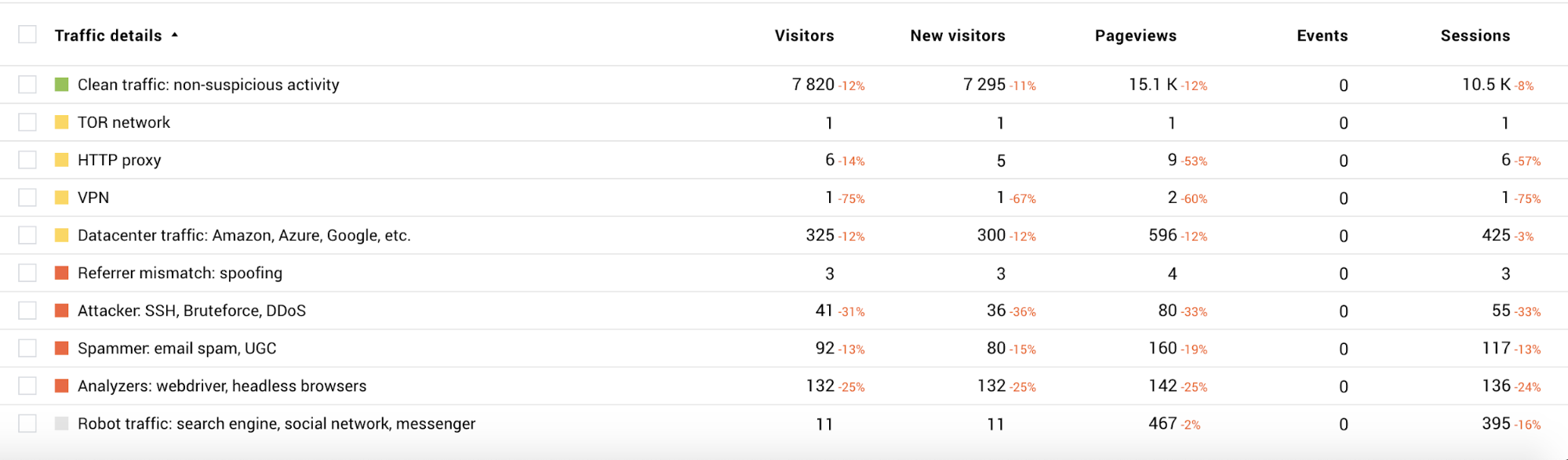
Source: Finteza
The fact that data visualizations can provide organizations with the ability to identify drawbacks and optimize their processes means that it can be a wonder why everyone isn’t doing it. The visualization of information is an applicable measure for virtually all industries today and can save time and, ultimately, money in getting to the bottom of emerging issues. For example, data visualization in clinical trials can not only help hospitals and researchers identify if a particular drug has been successful, but it can also help them to escalate a case further by visually representing how the drugs have performed. This, in turn, can help medical organizations to win grants to carry out more trials or release the drug into mass markets to potentially save lives.
Fundamentally, big data and advanced visualization tools have provided businesses with the agility to identify problems and showcase talking points to board members and stakeholders with an unprecedented level of convenience. In an industry that’s expected to continue growing exponentially over the coming years, it’s worth more for businesses to look into how data visualizations can help provide a refreshing array of clarity to the individuals who need to know in a fast and efficient manner.
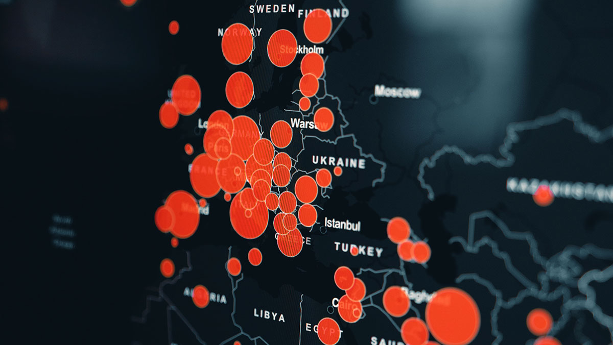
Cover image source: Clay Banks