
Kaspersky is a cybersecurity giant, with offices in over 30 countries and serving more than 400 million users and 270,000 corporate clients, worldwide. They needed a brand that would not only stand out against the dark, doomsday, Matrix-esque world peddled by its industry competitors but also resonate with an international customer base.
In collaboration with a dedicated team from Kaspersky, Moving Brands was in charge of this transformation. Here’s the process and the story of how these teams translated a new brand vision into a strategic rebrand.
The brief
For Kaspersky, the need for a new brand came as part of a wider repositioning within the market. Seeking to move away from the anxiety-inducing associations, typical for the industry, and looking to reflect a more positive outlook and brighter vision – an ethos personified by founder and CEO, Eugene Kaspersky.
The process – immersion
With this in mind, we began by immersing ourselves in the business, studying the long-term strategy and goals, taking time to understand their direction of travel, culture, and values, alongside notable accomplishments and recent wins, looking to really understand what was driving the need for a rebrand.
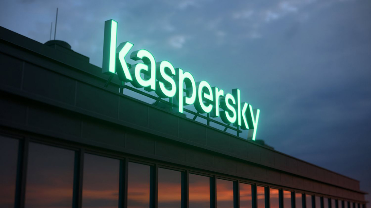
Today, Kaspersky is one of the few Russian brands recognized around the globe, but as the internal marketing and strategy team had come to realize, the foundations of the previous logo and brand style were no longer relevant, feeling outdated and not truly reflective of this new, high-tech organization – this was immediately obvious and something that needed to be addressed.
The process – creative
Armed with this background information and an abundance of competitor research, the team began thinking more about the creative aspect of the brand.
At this stage, being able to work collaboratively and communicate honestly with a client is an absolute must. Luckily for us, Kaspersky created a small working team assigned to the project. This included marketing, strategy, leadership, and design team members, who were all able to offer their own perspectives and honest opinions on our suggestions.
Unlike some projects, where you find yourselves presenting to upwards of fifty people, this small working group ensured we could easily bounce ideas, absorb feedback, and work together on identifying fresh, exciting, and distinctive elements of the brand and product offering.
During these initial workshops and group sessions, the team recorded an immense amount of feedback – using post-it notes and flip charts to create a simple, yet effective visual mind map of ideas and opinions.
One thing we were careful to keep in mind was that this rebrand needed to be approached from a digital-first perspective, and it was our responsibility to consider not only the graphic design elements but also how this brand might ‘live’ in both the digital and physical world.
During these workshops, it’s always our aim to spark vibrant conversations and evoke strong emotions, slowly funneling the group ideas into more concrete examples of what the new brand could actually ‘look’ and ‘feel’ like. To do this, we rely on found imagery and motion graphics, which facilitate a more visual and sensory experience for the client but can easily be discarded if they don’t quite meet expectations.
The ‘48-hour test’ is key, as this gives the client time to digest the information, process the visuals, and consider any limitations while also taking the time to speak to their own internal teams and gathering a broader opinion on our suggestions.
It was during these sessions that we began to appreciate the problematic nature of the original wordmark. Using shapes from the Greek alphabet created problems for the global marketing team, with issues around pronunciation and translation. The strategy team was also reluctant to take this logo forward, having first been developed in 1997, it no longer commanded the respect the company deserved in the cybersecurity market.
The process – presentation
Following workshops, group meetings, one-to-one sessions, and video calls, we presented two divergent creative routes, one based around the idea of insulating people from the danger of the cyber world. This route portrayed transparency, using warm bright colors and a promise of safety.
The second route was centered on the idea of Kaspersky engineering providing safety and immunity from cyber attacks and breaches. This route was precise and more structured but still carried the idea of openness.
The discussions that followed allowed us to take elements of both proposals and incorporate them into the final route, with various iterations along the way.
The final brand we proposed to stakeholders delivered a vibrant and optimistic identity, championing transparency, simplicity, and innovation, wrapped up in the phrase “Engineered for immunity”.
Engineered for immunity
The ‘engineered’ aspect of the concept is expressed in the machined quality of the Kaspersky wordmark and bespoke typeface, supported by a grid system that enables highly structured, yet flexible, typographic compositions. Despite some initial skepticism towards the custom typeface, we stuck to our gut feeling – that it would work.
Developed in close collaboration with the type foundry Colophon, Kaspersky Sans was created to enable every communication to convey the brand personality, but remain simple enough to work on an international scale. This idea was born from our extensive conversations with the internal marketing and strategy teams, who emphasized the importance of a truly recognizable, yet transferable brand style.
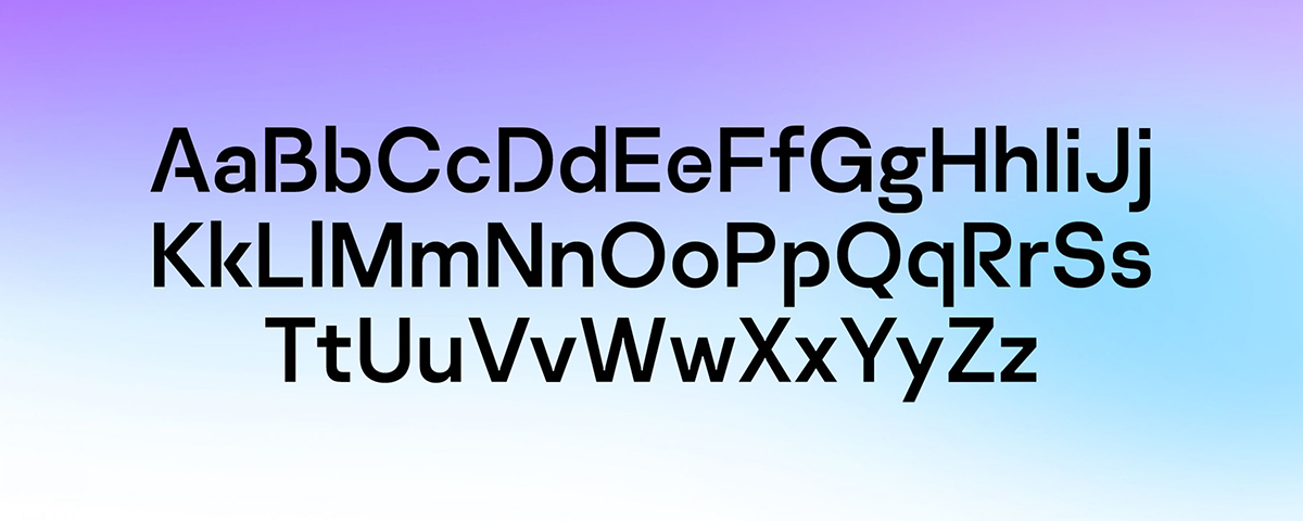
The typeface features micro-detailing, such as chiseled ink traps and 90º terminals, as well as contextual open characters for use in display copy. The font was designed with versatility in mind, including a range of weights and secure alternate characters to ensure functionality and legibility on any device and in any market.
The protection provided by Kaspersky must inspire a sense of safety and freedom – another core focus of the business. To express this idea, the ‘immunity’ layer is conceived as a vibrant and intelligent energy field that creates a ‘secure space’ at its core. Depending on the situation, the energy field varies in intensity to maintain optimal immunity and echoes the adaptive protection that Kaspersky provides.
The ambient, graphic, and keyline variants of the immunity layer enable a broad range of expression appropriate for different contexts, messages, and audiences, easily recognized and suitable for the age of the mobile app and the website favicon.
The process – building the assets
A rebrand of this scale required an extensive collection of physical assets to be developed, alongside detailed written guidance on how to use the new brand, style guides, templates, master logos, color palettes, textures, press ads, and letter and packaging styles.
This was especially important for Kaspersky, who sought to roll out the new brand on a global scale, relying on a number of different internal marketing teams.
You work on the creation of a brand, then you live with it in the world around you.
Understanding that no identity should ever be unleashed to the world without continued steering or guidance, Nikita Morozov, Head of Design at Kaspersky, has maintained a central position in nurturing the new brand’s rollout.
Ultimately, Kaspersky’s approach (to be reflected in the rebrand) was one of openness and hope – let’s work on a better system that will make global cyberattacks worthless and meaningless. Without losing the iconic green color which was already associated with Kaspersky, the new identity drives this positive agenda. The company enables people to innovate and use technology without fear.